Building a Wireframe Kit
Building a Wireframe Kit
Building a Wireframe Kit
Based on a design system to explore ideas before bringing them to life.
Based on a design system to explore ideas before bringing them to life.
Based on a design system to explore ideas before bringing them to life.
Role
Role
Product Designer at Ooma
Product Designer at Ooma
Duration
Duration
4 Weeks
4 Weeks
Tools
Figma
Jira
Design process
Research
Iteration
Built components
Mockups
Tools
Tools
Figma
Jira
Figma
Jira
Design process
Design process
Research
Iteration
Built components
Mockups
Research
Iteration
Built components
Mockups
Introduction
Introduction
Introduction
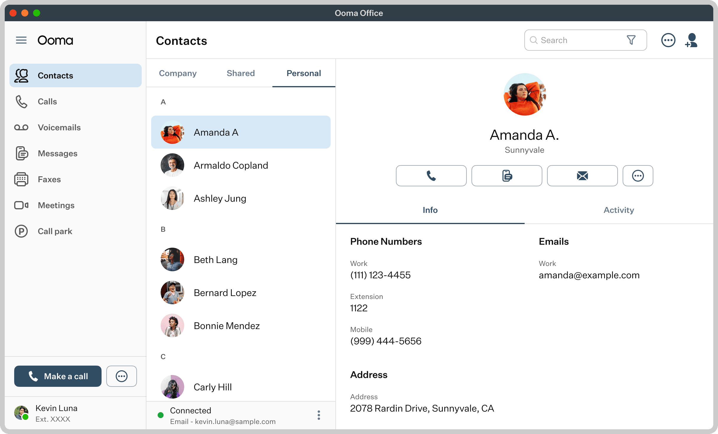
The task of this project was to build a Wireframe Kit based on Ooma’s Design System to create quick and simple designs for explorations before moving with high-fidelity mockups.
The task of this project was to build a Wireframe Kit based on Ooma’s Design System to create quick and simple designs for explorations before moving with high-fidelity mockups.
Problems
Problems
Problems
The current issues presented on our team are the following:
Exploring and building things directly in high-fidelity can require more effort than it should at a project's early stage.
Things like spacing, padding, colors, among other things can also distract us from solving the real issue.
Sketching or using current kits can become difficult and tedious since we have a specific set of components and guidelines to follow as well.
Sometimes developers and project managers get confused and start grabbing high fidelity drafts that aren't ready for production.
Research
Research
Research
The first steps of building this kit involved reviewing previous ideas that the team had built for a possible kit as well as viewing other tools used for building Wireframe Kits. Part of this also involved the colors and typography that the kit could have for people to quickly differentiate between high-fidelity mockups and wireframes.
The first steps of building this kit involved reviewing previous ideas that the team had built for a possible kit as well as viewing other tools used for building Wireframe Kits. Part of this also involved the colors and typography that the kit could have for people to quickly differentiate between high-fidelity mockups and wireframes.
Original UI
Original UI
Original UI
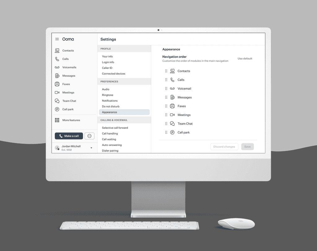
The original UI for Ooma uses greyscale colors so this serves a challenge to create a kit. Most of the times we associate these colors with Wireframes so the idea would be for the kit to use different colors that can be distinct enough from this UI.
The original UI for Ooma uses greyscale colors so this serves a challenge to create a kit. Most of the times we associate these colors with Wireframes so the idea would be for the kit to use different colors that can be distinct enough from this UI.
Examples
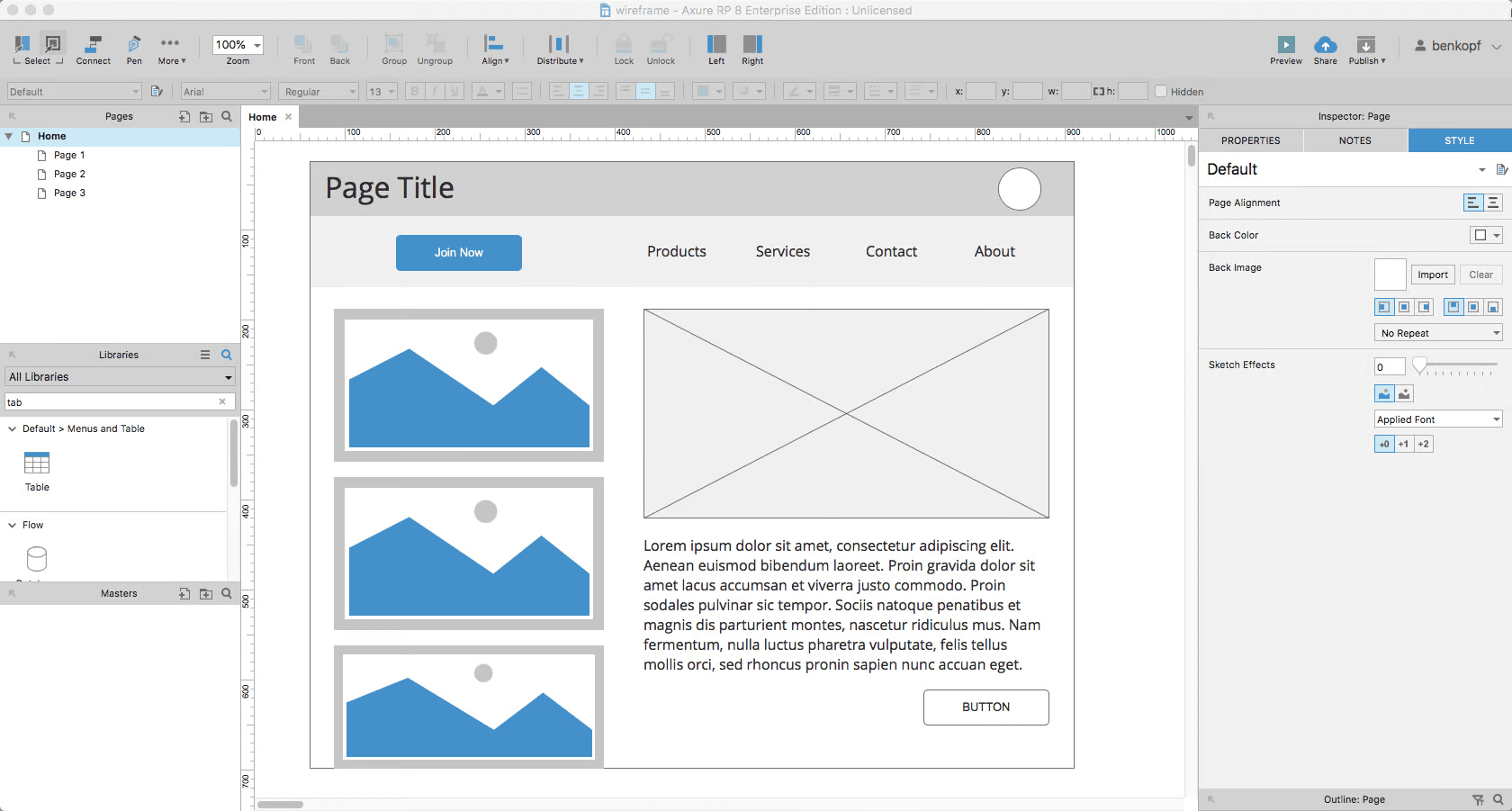
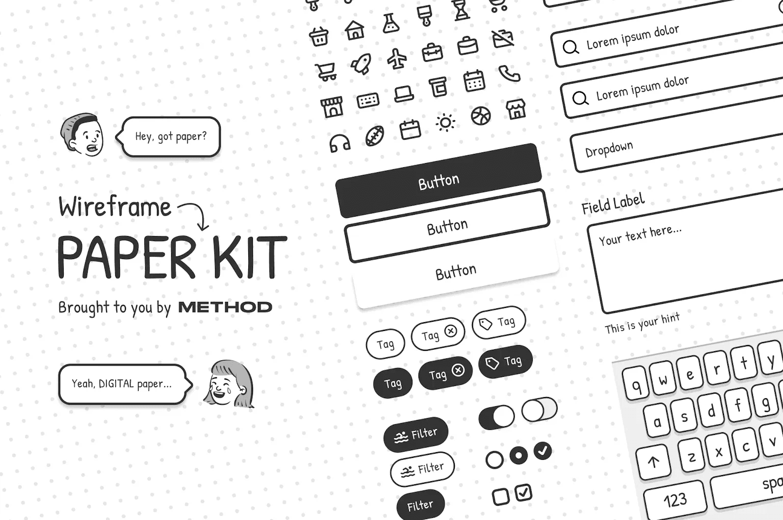
I started looking at examples of current tools used for Wireframing. The main ones I focused were Balsamiq, Axure, and Figma's Paper Kit. Their main elements I noticed were:
Greyscale colors
Roundness in components and outlines
Lack of striking visuals or vibrant elements
Cartoonish fonts
I started looking at examples of current tools used for Wireframing. The main ones I focused were Balsamiq, Axure, and Figma's Paper Kit. Their main elements I noticed were:
Greyscale colors
Roundness in components and outlines
Lack of striking visuals or vibrant elements
Cartoonish fonts
Ideas
Ideas
Ideas
I started exploring with Ooma's current UI to understand a bit better what can I change to make it distinct enough that it doesn't look like the high-fidelity UI. Some ideas I had were:
Adding hints of color to components to counter the greyscale colors
Add background colors as well to strike a bigger difference between both UIs
Make the whole app with a monochrome vibe
Explore with cartoonish fonts
Colors
Colors
Colors
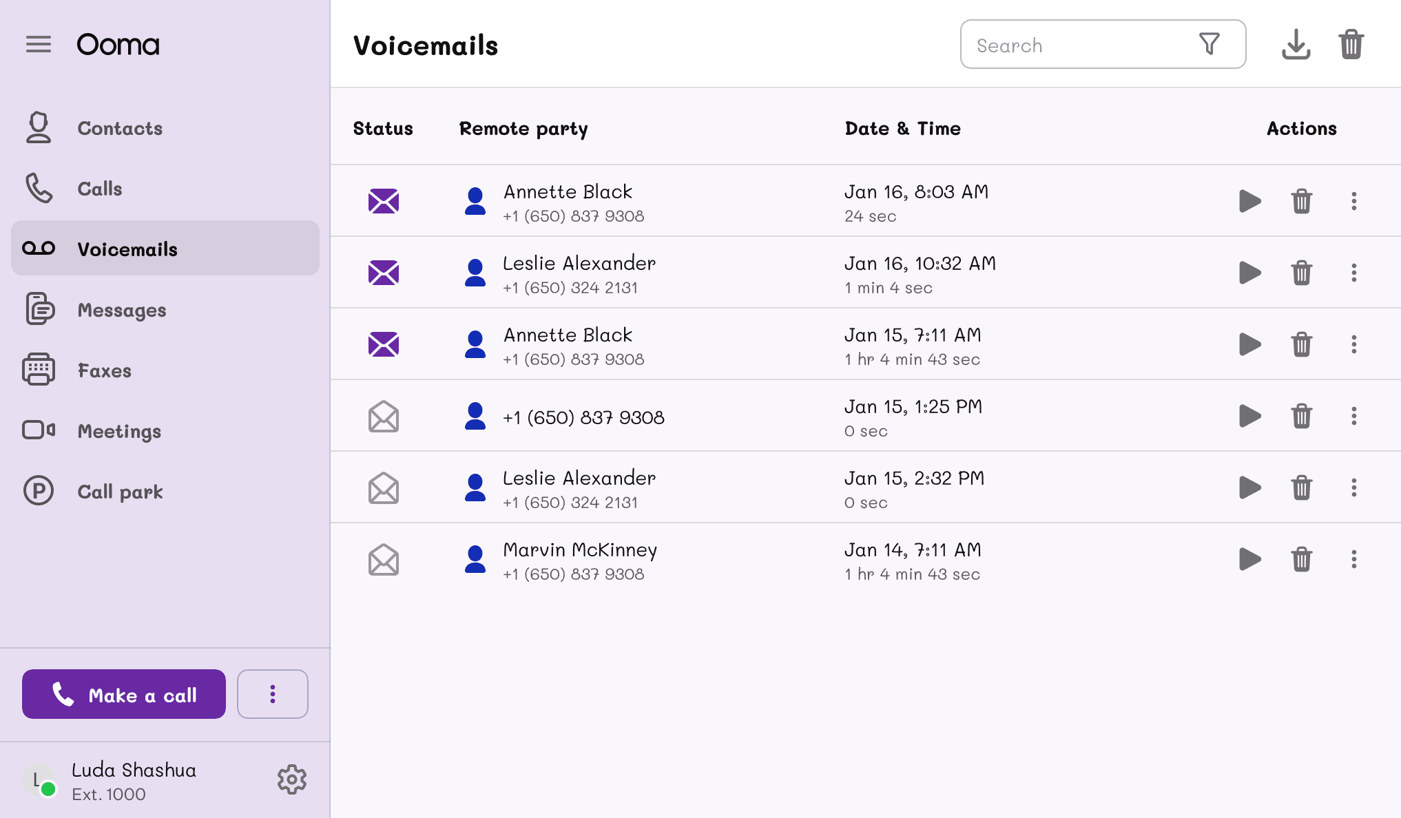
A big challenge for the decision of the colors was to make them feel distinct from the final mockups. Since the final mockups used colors that leaned more towards a greyscale design, a solution that we, as a team decided on, was to use colors more on the blueish spectrum and design the structure a bit more monochromatic.
The blue would feel like the ink used in pens and can help the user associate it with when you use a blue pen on a piece of paper to start drawing sketches or blueprints of possible designs.
We also kept colors used for alerts, but tone them down as well to match the kit's vibe. These colors would only be used in very specific scenarios where we want to highlight these alerts a bit more.
Typography
Typography
Typography
For the typography, we wanted to stray away from the original font from the final designs and went with a Low-Fidelity approach at first.
For the Low-Fidelity font, we went with a more gibberish type of font that looked like the usual scribbles that a person does when they want to symbolize a line of text. This would help the viewer understand that the text isn’t important at the moment and the most important part would be the structure of the design.
Design
Design
Design
For the design of the kit, we based it on the current components used in the original design and simplified them to a more barebones structure.
The main ideas that we implemented were to use thick outlines to highlight more the structure of the design and reduce the components to basic shapes with few elements and variants.
Explorations
Explorations
Explorations
Some of the explorations done at this point involved recreating certain type of components we currently use in our design system. These components are:
Cards
Buttons
Tables
Header bars
Dialogs
List items
Text fields
We also explored with other ideas specific for Wireframing such as shapes, blocks of text and arrows for user flows.
Implementation
Implementation
Implementation
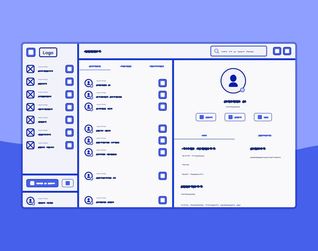
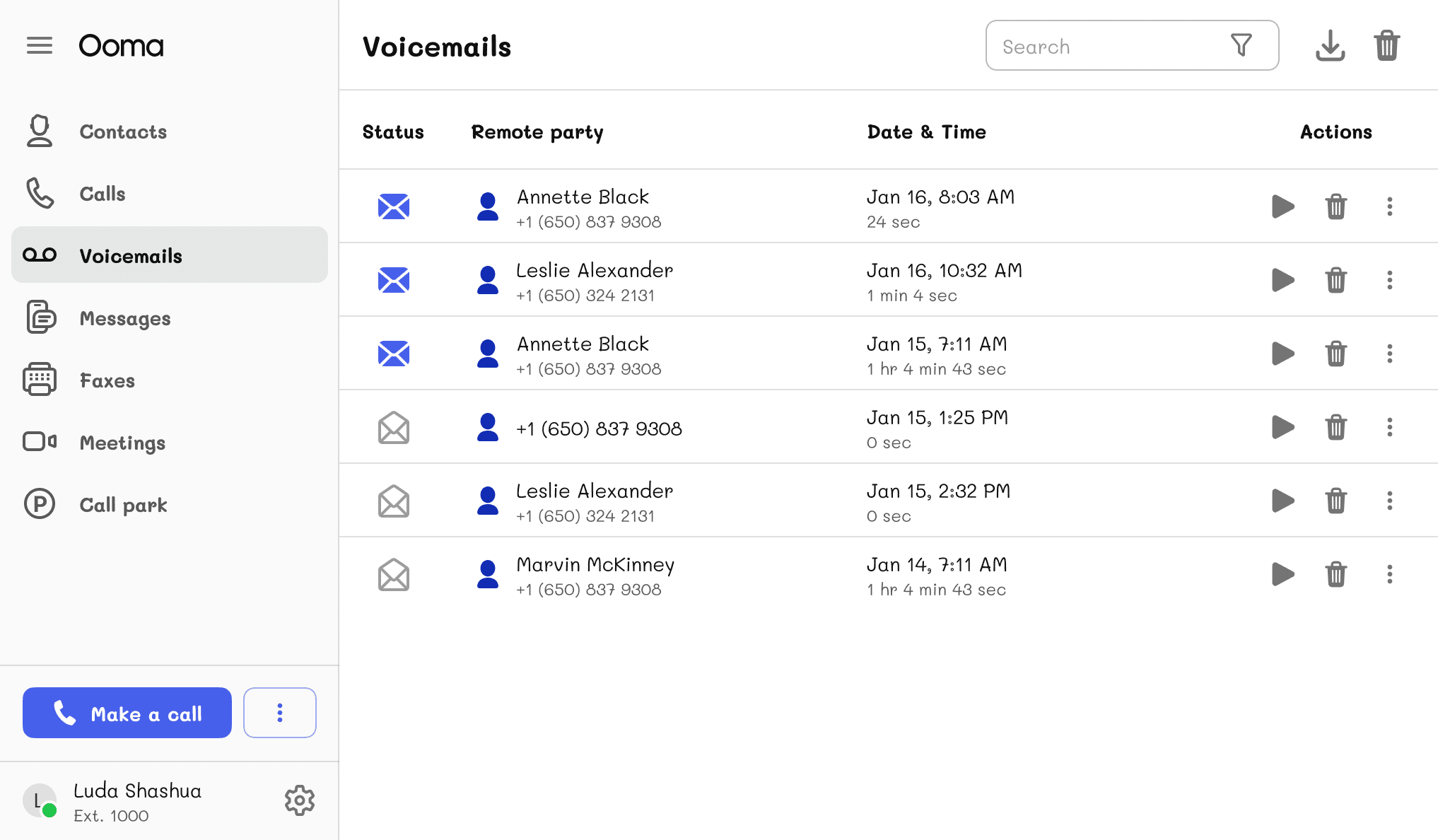
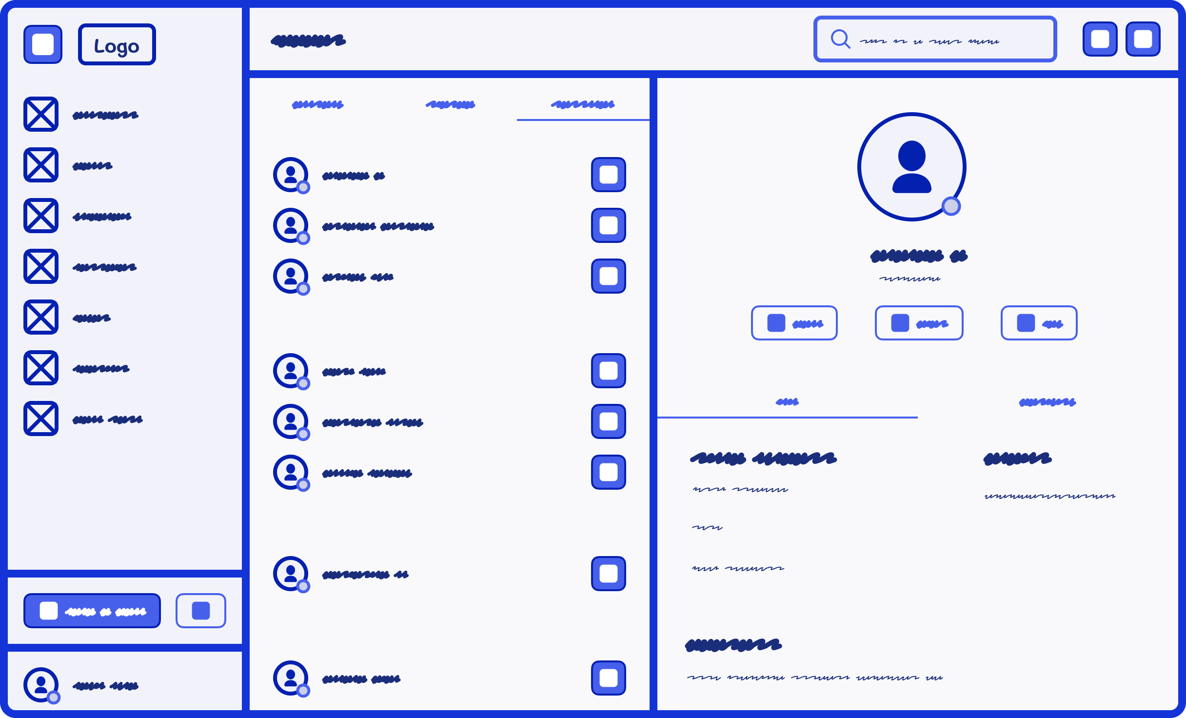
We then implemented these ideas and started building the library in Figma. We built some templates as well to look at how the kit could work with current views that we have in our app.
This view in particular represents how the Contacts page looks.
We then implemented these ideas and started building the library in Figma. We built some templates as well to look at how the kit could work with current views that we have in our app.
This view in particular represents how the Contacts page looks.
Testing
Testing
Testing
Once the colors, typography, and components were structured and defined, the kit was published for the members of the team to start using it.
Once the colors, typography, and components were structured and defined, the kit was published for the members of the team to start using it.
Benefits
Benefits
Benefits
The main benefits of using the kit were the following:
Building and sketching was easier and faster
Distractions about spacing, color usage, and padding were gone during this stage
Having our design system recreated in Wireframes improved the way we created drafts and ideas for future products
Developers and project managers now understood better when designs were drafts and when they were ready for production.
Improvements
Improvements
Improvements
A Mid-Fidelity font
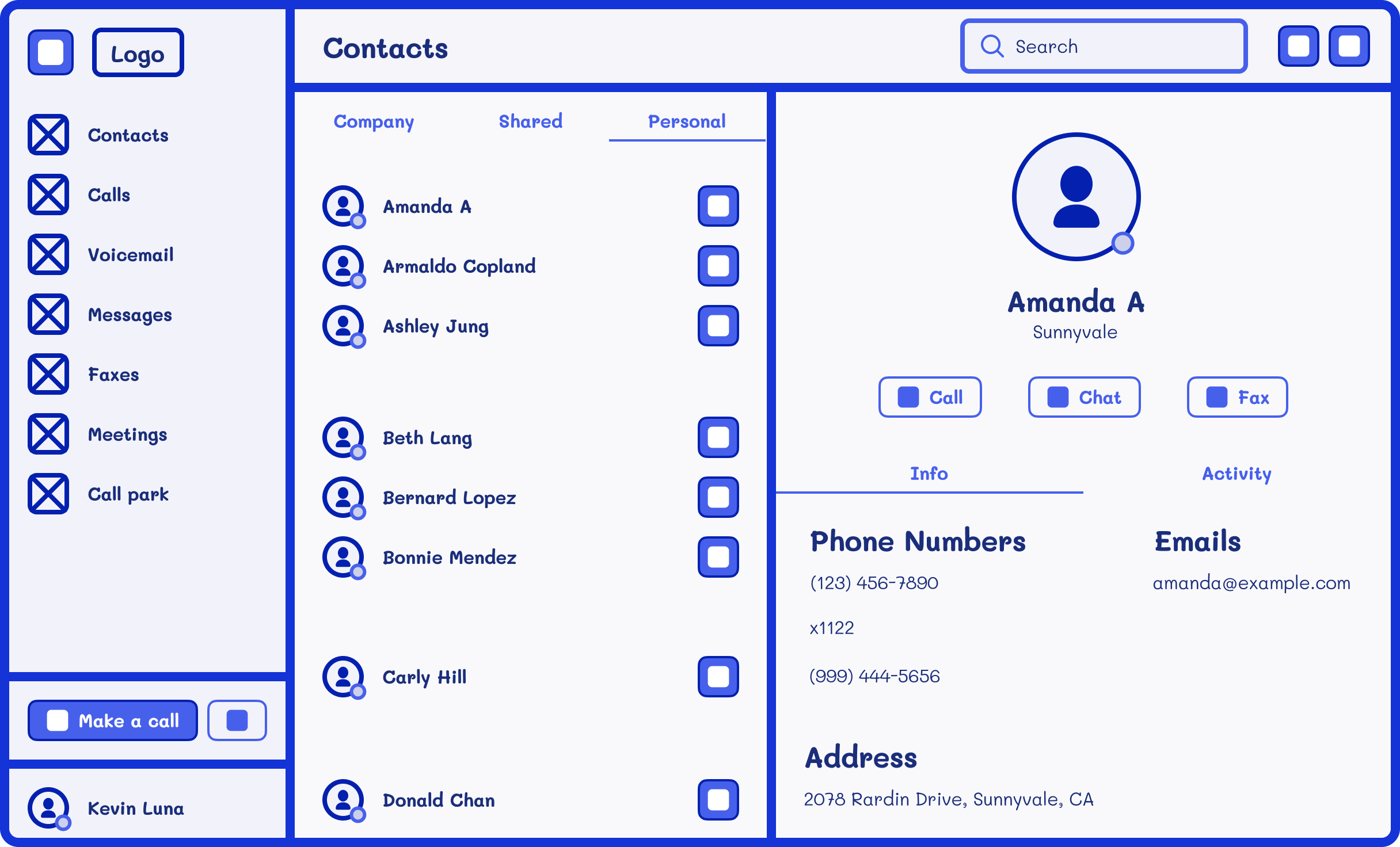
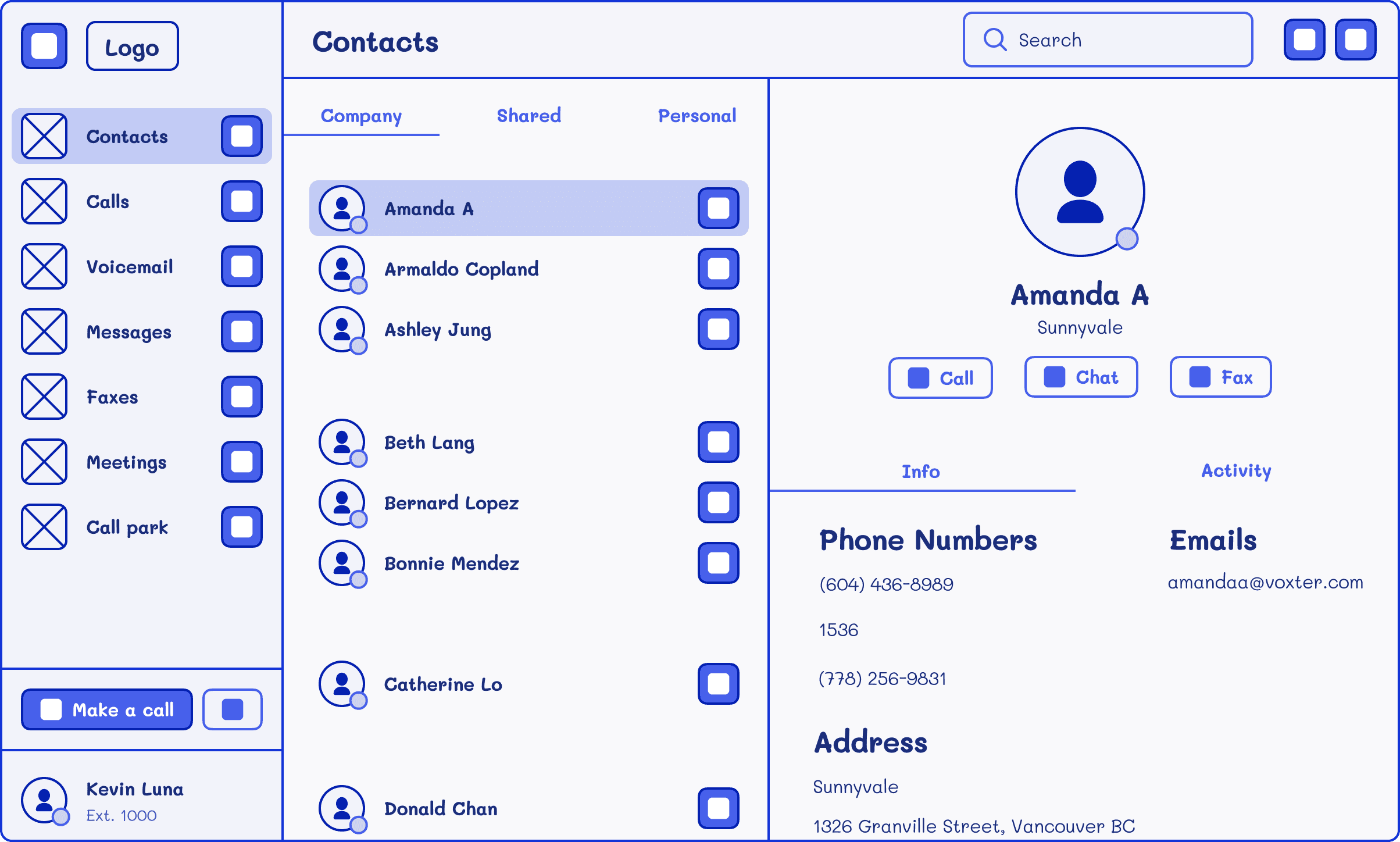
As the team tested the Wireframe Kit, notes were taken to improve the usability of the kit. One of these improvements was the option to switch between Low-Fidelity and Mid-Fidelity fonts.
For the Mid-Fidelity font, we went with a more cartoonish type of font that was different than the official font but was readable enough. This would help the viewer understand better certain areas of the content that’s on the design but still feel like it’s not a final product.
A Mid-Fidelity font
As the team tested the Wireframe Kit, notes were taken to improve the usability of the kit. One of these improvements was the option to switch between Low-Fidelity and Mid-Fidelity fonts.
For the Mid-Fidelity font, we went with a more cartoonish type of font that was different than the official font but was readable enough. This would help the viewer understand better certain areas of the content that’s on the design but still feel like it’s not a final product.
Thin outlines
Another suggestion made was to tone down the thick outlines since they were very distracting when designing and could shift focus from the real issue which is to sketch ideas for the products we're making. The outlines were toned down in all components and the designers appreciated this change and were better focused in creating designs.
Suggestions after that kept coming. The creation of new components, the adjustment of some components to have different sizes, among others. This is a project that's always looking to improve and become a better tool for designers to develop ideas before bringing them to life.
Suggestions after that kept coming. The creation of new components, the adjustment of some components to have different sizes, among others. This is a project that's always looking to improve and become a better tool for designers to develop ideas before bringing them to life.
Conclusion
Conclusion
Conclusion
This project overall helped the design team with future explorations of design flows and improved the team’s performance as well.
Focusing first on the sketches and wireframing before the final design helped us to avoid distractions regarding padding, margins, and content and pointed our attention more toward the main structure of the design and the user experience.
Other projects
Other projects
Other projects
View other projects that I've worked on during the years.
View other projects that I've worked on during the years.
View other projects that I've worked on during the years.
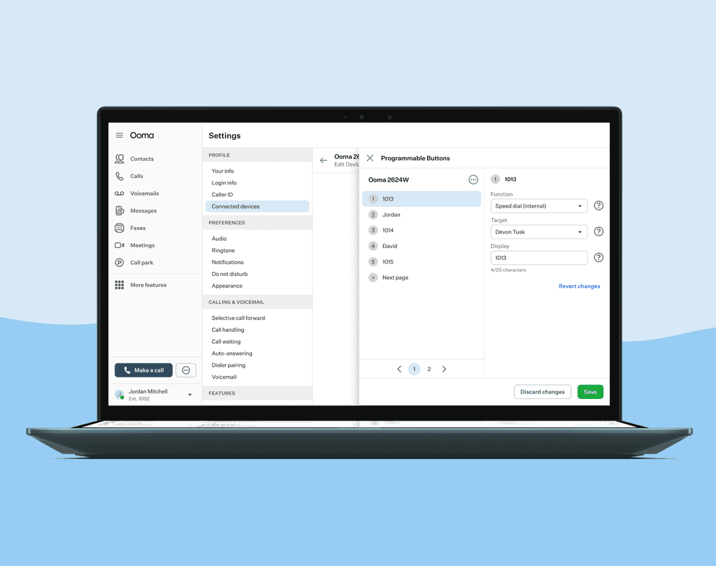
Configure Programmable Buttons in devices
Set your device to have different features depending on what you click.
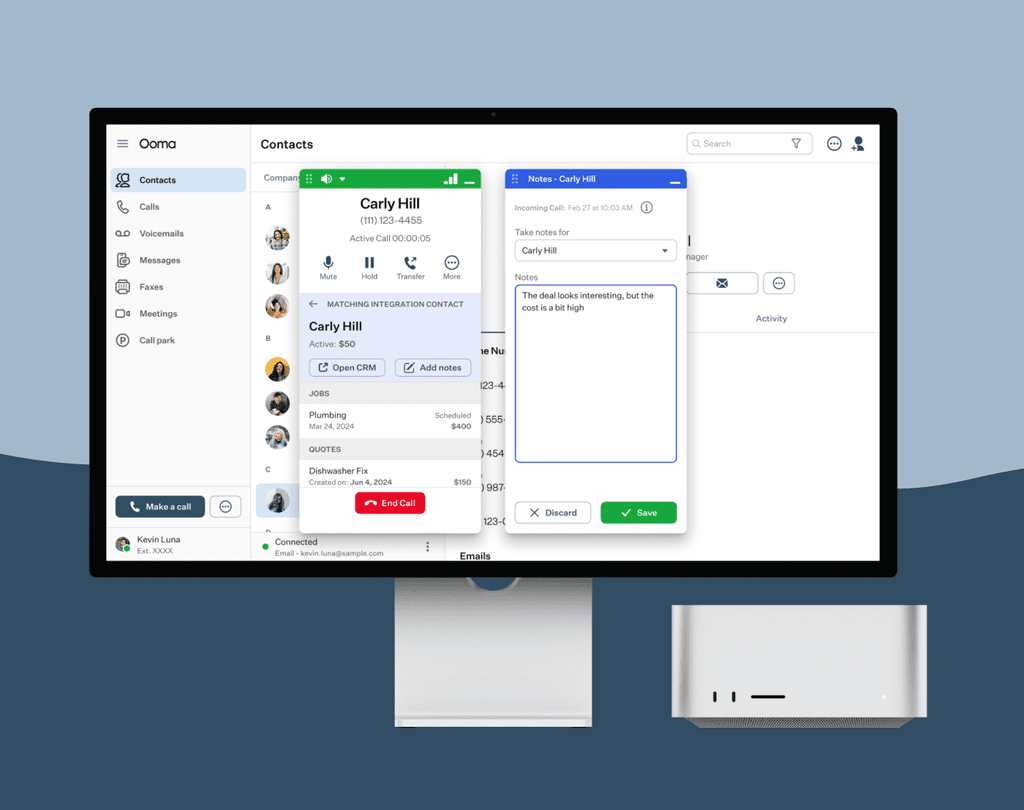
Add notes while taking calls
Connect with our different CRM Integrations and take notes of conversations with your client.